Stockholm travel guide
This is my pet project. I handle everything: content, design, coding, and marketing.
I kicked it off in February 2025 and have been improving it step by step ever since.
Guide cover photos by Karl Hedin and Marten Bjork

PITCH
A guide helps plan a stay in Stockholm and not waste time — avoid overhyped places, skip boring-to-death descriptions, quickly go from choosing a place to mapping out a route.
CONTEXT
What we know about city visitors
Stockholm regularly posts statistics and survey results, which help decide whether to make a guide and, if so, who for.
So even though most of Stockholm visitors speak Swedish, the next main language is English. Plus, Swedes have extremely high knowledge of English — Sweden is 4th in EF ranking of countries by English skills.
That's why I am making a guide in English first — with a potential translation to other languages.
DESIGN PROCESS
Guide name
I called this guide Modern Stockholm Guide — SEO-friendly, easy to remember, and playing with meanings as both the city and the guide are modern.
Guide logo
I went with a looped square for the logo — it’s been a classic Nordic symbol for attractions since the ‘50s. And since it’s also the Command key today, it’s a perfect match for a modern guide.
Approach to content
The goal is to stand out from other sites. That's why the guide is playful in terms of design and tone-of-voice.
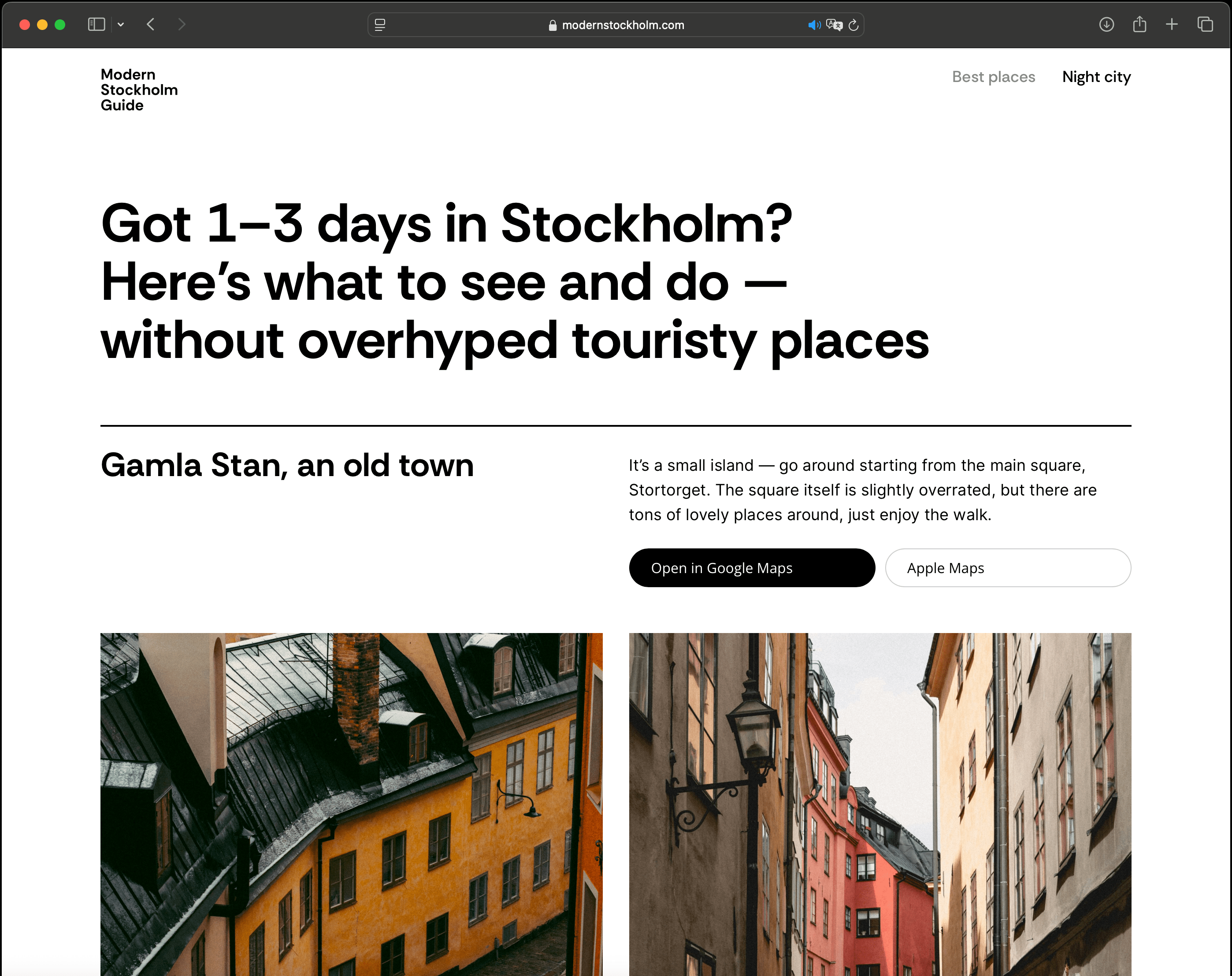
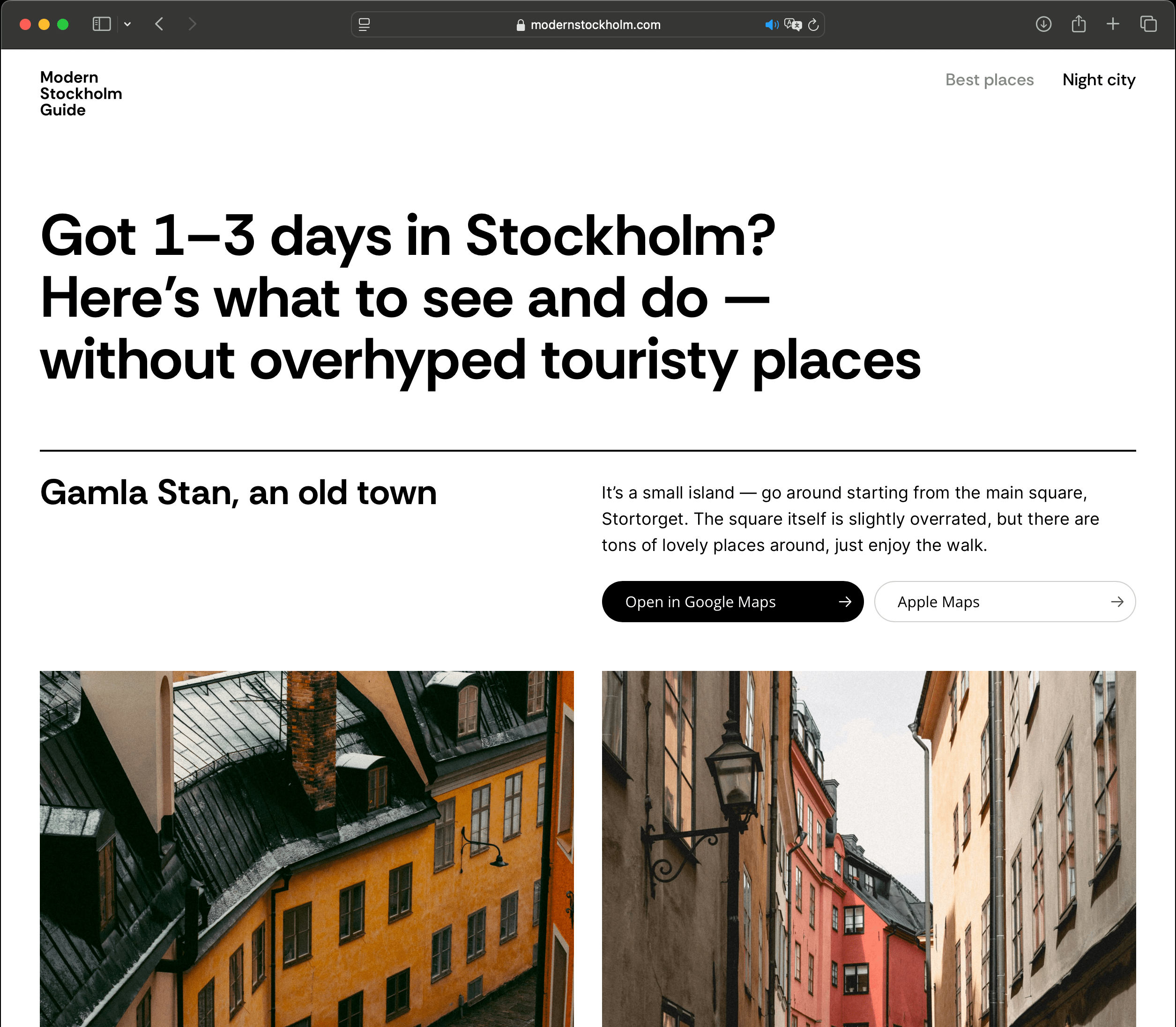
At the same time, I keep it simple for travelers — a place name, big photos, a few words to see if it’s worth a visit, and links to Google and Apple Maps.
Layout of website
The guide features a modular grid system, wide high-quality photos and ultra-short texts for better readability.
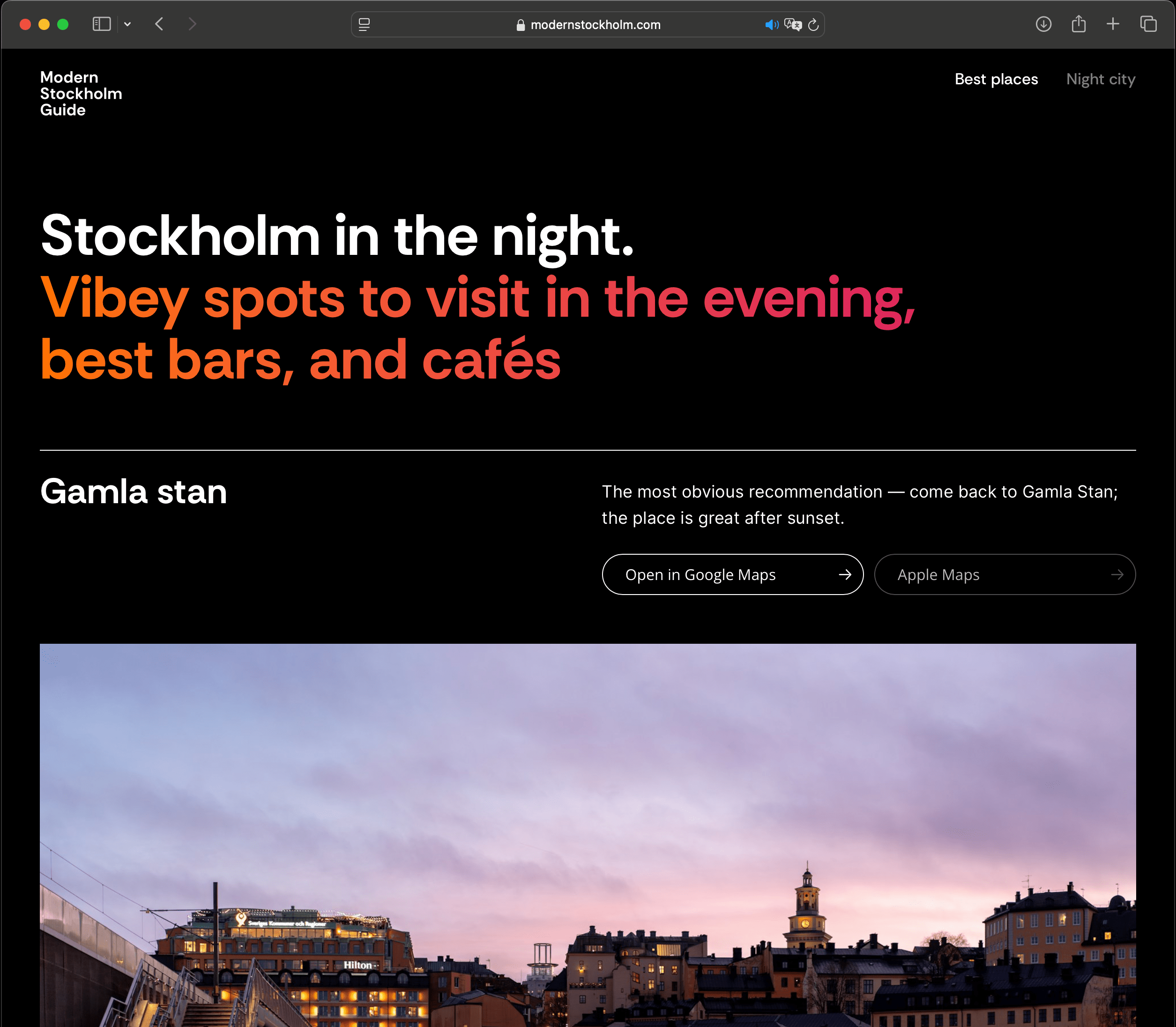
The core structure stays the same across all pages, but the site always plays with the theme — like if a page is all about Stockholm at night, the whole design goes dark.


APPROACH
Step-by-step release
I followed the Fix Time and Budget, Flex Scope principle from Basecamp’s blog. Rather than developing a complex website all at once, I launched it step by step.
For the first iteration, I created two pages — main spots and night city — covering the basics for trip planning. I used Unsplash photos instead of hiring a photographer, with plans to reshoot later for a cohesive style.
This approach delivered a quality product on time and budget, with room for ongoing improvements.
Immediate production
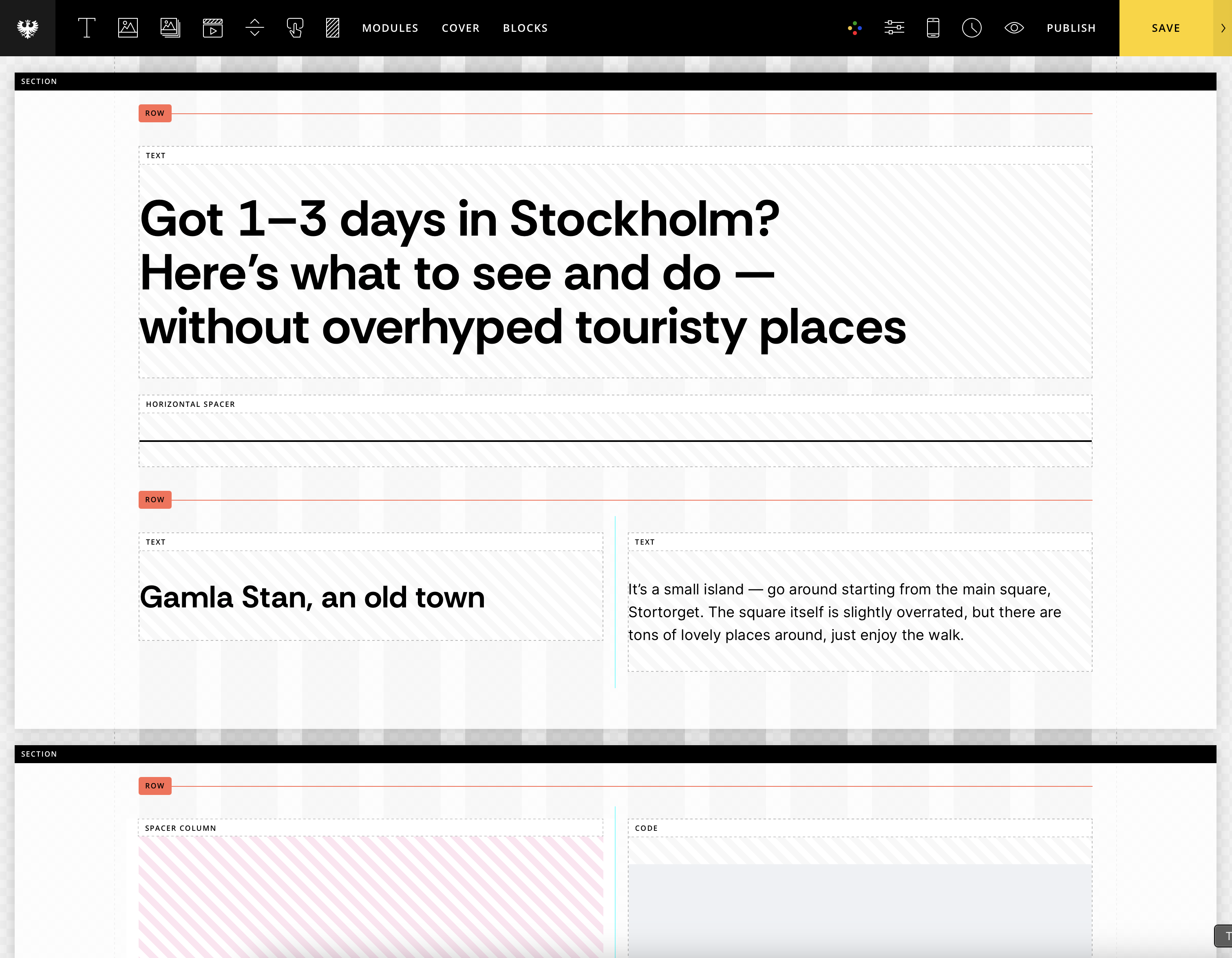
To make it simple I skip Figma and design right inside CMS — making it real to publish all changes just pressing one button.

I use Semplice — it’s basically a CMS built on WordPress.
Made special for designers and lets you work with grids and set up different layouts for different screen sizes.
VALIDATION & RESULTS
Collecting key metrics
I’m tracking site visitors with Yandex Metrika tool. It’ll take some time, I’ll be back with numbers later. Here’s what I’m looking at:
Monthly active users
Conversion rate on maps buttons
Pages per session
Georgaphy of users
Device analysis